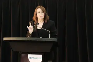


“We feel the time is right for this bold change in our identity and the way we sell our city to reflect the evolution of our business, as the world of business events has shifted dramatically, with new business models, new ways of working, connecting and gathering,” said BESydney’s CEO, Lyn Lewis-Smith.
“We are the city’s international advocate with the responsibility for attracting global business and academic audiences to Sydney to get the fresh perspective they need to change their worlds.
“Our customers are wanting to know where we stand on sustainability, diversity, equity and inclusion, and delivering CSR outcomes. They are wanting values-alignment, a deeper cultural connection, and a more immersive experience in the destination when they get here.
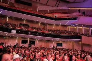
“This is Sydney, and Australia’s, ‘sweet spot’. As the city demonstrated by hosting the most welcoming, inclusive, accessible and sustainable WorldPride festival and Human Rights Conference this year, we have come of age on the global meetings stage – and our new brand and logo reflect that confidence.”
The new digital presence of BESydney includes content which homes in on Sydney’s sector strengths and mixes intellectual capabilities with place. Case studies sit alongside deep dives into Sydney’s innovation precincts and developments that have become home to particular industries – from Barangaroo to Tech Central.
“The new branding and website are backed up by the most comprehensive review and re-calibration of our content strategy in our organisation’s 50-plus year history,” said BESydney’s general manager content, creative and corporate affairs, Carolin Lenehan.
“We feel we have captured Sydney’s unique duality as an iconically recognised and aspirational visitor destination with a globally competitive business heart.
“It’s a delicate balance, but we believe by showcasing Sydney’s people, place and purpose, we’ve been able to showcase the intertwined strands of our city’s DNA.
“All this is presented in a vibrant new colour palette reflecting our harbour city’s blue skies, sea and sand along with the vividness and buzz of energy that Sydney creates.
“This is a significant moment for our organisation’s brand evolution to a logotype where Sydney stands confidently in its own right to own the position as the Asia Pacific’s preeminent business visitor destination,” said Lenehan.