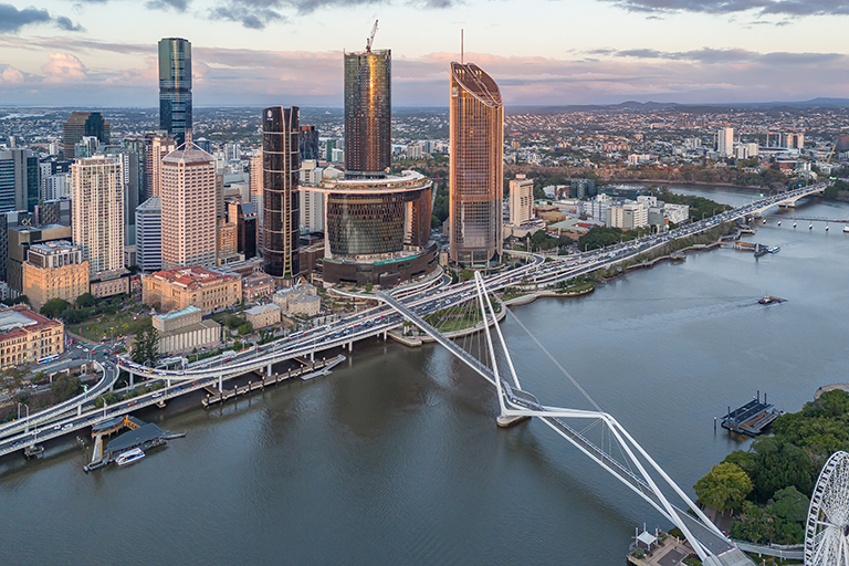
The Star’s Queen’s Wharf exit in doubt
The two buyers of The Star Entertainment Group’s investment in Queen’s Wharf have given notice to terminate the


The two buyers of The Star Entertainment Group’s investment in Queen’s Wharf have given notice to terminate the

FCM Travel has debuted an improved AI assistant called Sam, with FCM’s meetings and events arm likely to

An opening date has been set for Christchurch’s new multi-use stadium but its CEO, Caroline Harvie-Teare, would not
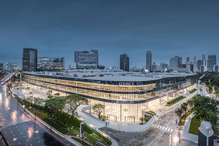
Queen Sirikit National Convention Center (QSNCC), in Bangkok, has announced a real-time carbon footprint tracking dashboard.
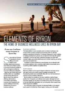
The Queensland Government has committed almost $4 billion to Olympic venue delivery alongside a huge investment in the
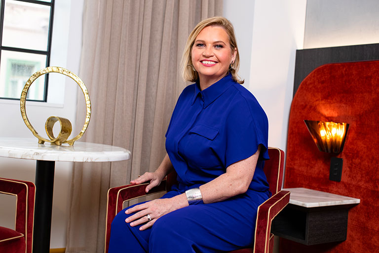
A former Accor leader has joined The Star Entertainment Group, while shareholders have voted in favour of The

Microhire and the Royal International Convention Centre (Royal ICC) at Brisbane Showgrounds have extended their partnership, with more

An interim program to attract visitors and business events to New Zealand’s largest city has been extended for
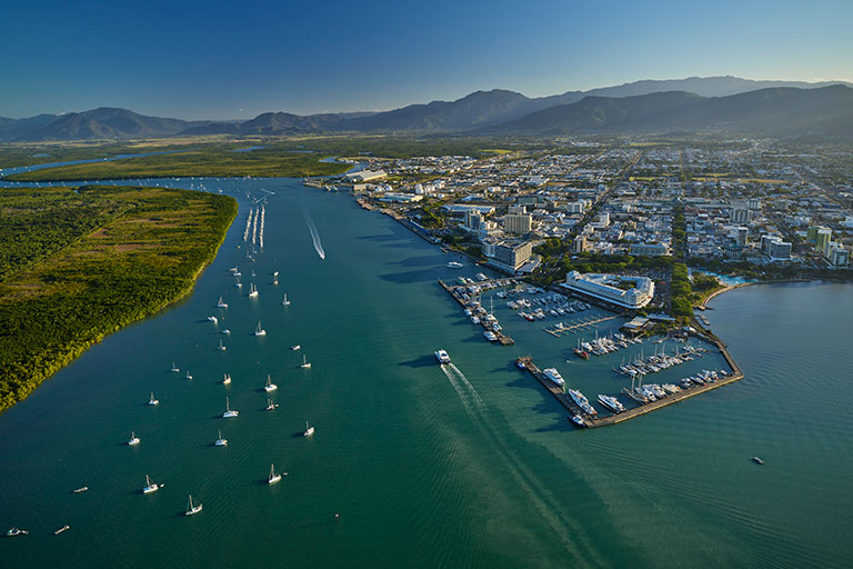
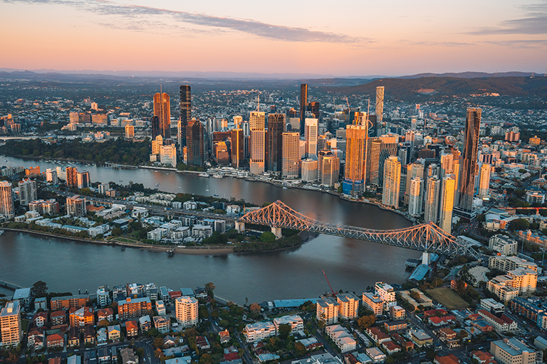
Cairns Convention Centre will host the Helloworld conference for owners and managers next June.

The majority of corporate event venues are being booked within six months of an event, according to a

The latest statistics from Tourism Research Australia show international visitation has, once again, recovered incrementally.
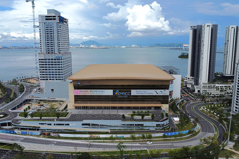
After a stellar year in 2024, Penang is looking to attract more business events with the opening of